ShopDreamUp AI ArtDreamUp


Suggested Deviants


Suggested Collections


You Might Like…


Comments2
Join the community to add your comment. Already a deviant? Log In
Yeah, smooth would be damn near impossible to work into a design, especially like this. I love the logo, it is simple, clean, bold, and fits the company name quite well. Everything that a logo should be.
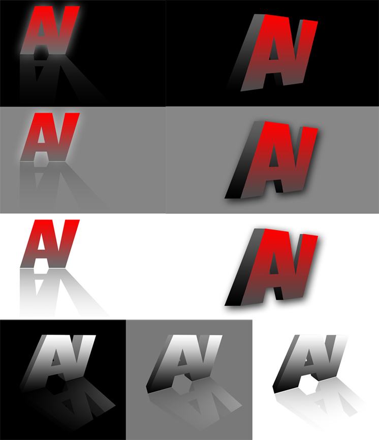
Alright, and as you requested the critique. Lets do this in order. The top left ones first.
I dont think the blur around the edges looks good on the one with the solid black background. It looks almost like it is over exposed or something like that. And on the grey it isnt very strong either. But, I do love the one on the white background. It is a really strong 2D logo. . Great use of negative space, it will pop on paper even if it were just a simple silhouette.
The bottom ones. I really like these ones. Looks great on all three backgrounds. I like how part of the logo dissapears into the background on the solid white and black but you can easily still make out the logo because it is such a strong logo. I have only two critiques for these ones. The vanishing point is very strangly placed in my oppinion. The bottom parts of the logo seem to have really strange angles. I would try moving the vanishing point way to the left. Also, maybe move the light source a bit lower and to the left in order to bring the shadow up a bit,.
And last is my favorite, the other three, top left. Strong, popping, all of that. It is great! It pops off the page on every single background. I love it! Of course, as always, I will be super picky. I dont think it has a working vanishing point. It seems like the shape gets bigger towards the back. And secondly, I dont like how it gets skinnier towards the back. Maybe a bit skinnier, but it gets so thin towards the V side of it that it just looks awkward. Also, now that I look at it, it is the exact opposite on the bottom 3, it gets too think on the V side of it (or too thin on the A side)
All around, freaking love the logo design. You did a kick ass job on all three versions. Even if you dont change anything, it is sick nasty. Love it!